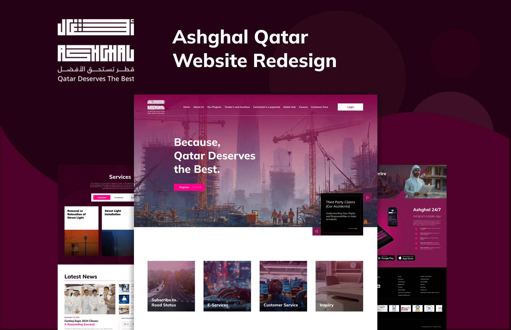
PROJECT OVERVIEW
In today’s digital landscape, a well-designed website is crucial for any organization, especially one involved in significant public works like a government building construction company in Qatar. The original website was a cluttered amalgamation of content that overwhelmed users and obscured important information. My mission was to transform this site into a modern, user-friendly platform that not only showcases the company's services but also enhances user engagement.DESIGN CHALLENGES
The existing website had several key issues:- Content Overload: Important information was buried under excessive text, making it difficult for users to navigate.
- Outdated Aesthetic: The visual design was uninviting, lacking modern appeal and professionalism. Poor User Experience: Users found it challenging to locate essential services and information quickly.
RESEARCH
Before embarking on the redesign, I conducted thorough research to understand both user needs and industry standards:-
User Interviews: Engaged with stakeholders and potential users to gather insights on their experiences with the existing website. Common pain points included difficulty in finding information and a lack of visual appeal.
-
Competitor Analysis: Analyzed websites of similar construction companies in the region. This helped identify best practices in design, user experience, and content presentation, allowing me to set a benchmark for the new design.
-
Usability Testing: Performed usability tests on the original site to observe user behavior and identify specific areas for improvement. This involved tracking how users navigated the site and where they encountered obstacles.
SOLUTION
To address these challenges, I implemented a comprehensive redesign that focused on clarity, aesthetic appeal, and user experience:-
Streamlined Content Structure: I organized the website content into clearly defined sections, allowing users to find information quickly and easily. Key services were highlighted prominently, ensuring they were accessible without excessive scrolling.
-
Modern Visual Design: I adopted a contemporary design language that included a clean color palette, cohesive typography, and high-quality images. This updated aesthetic not only reflects the professionalism of the construction company but also resonates with modern users.
-
Enhanced User Experience: By implementing intuitive navigation and interactive elements, I improved the overall user experience. Features such as a responsive design ensured optimal functionality across devices, catering to users whether they were on a desktop, tablet, or smartphone.
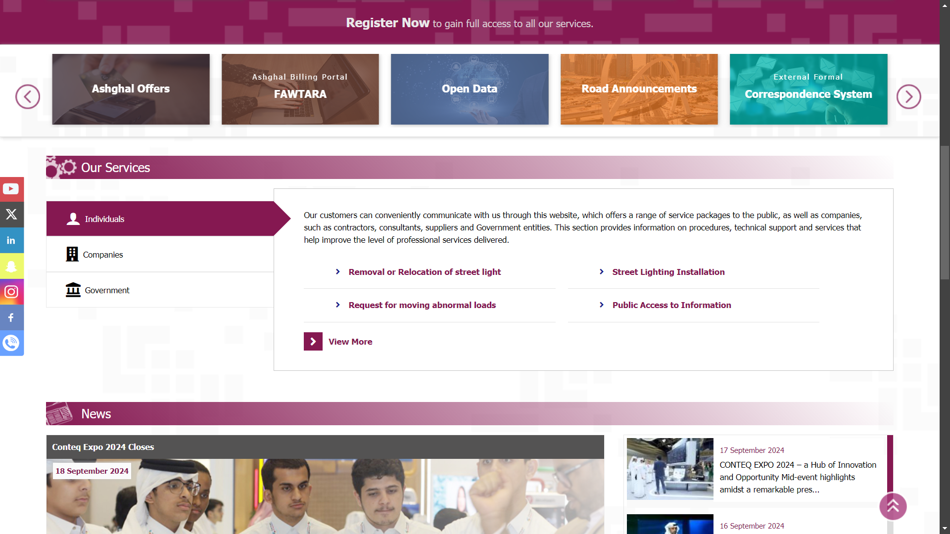
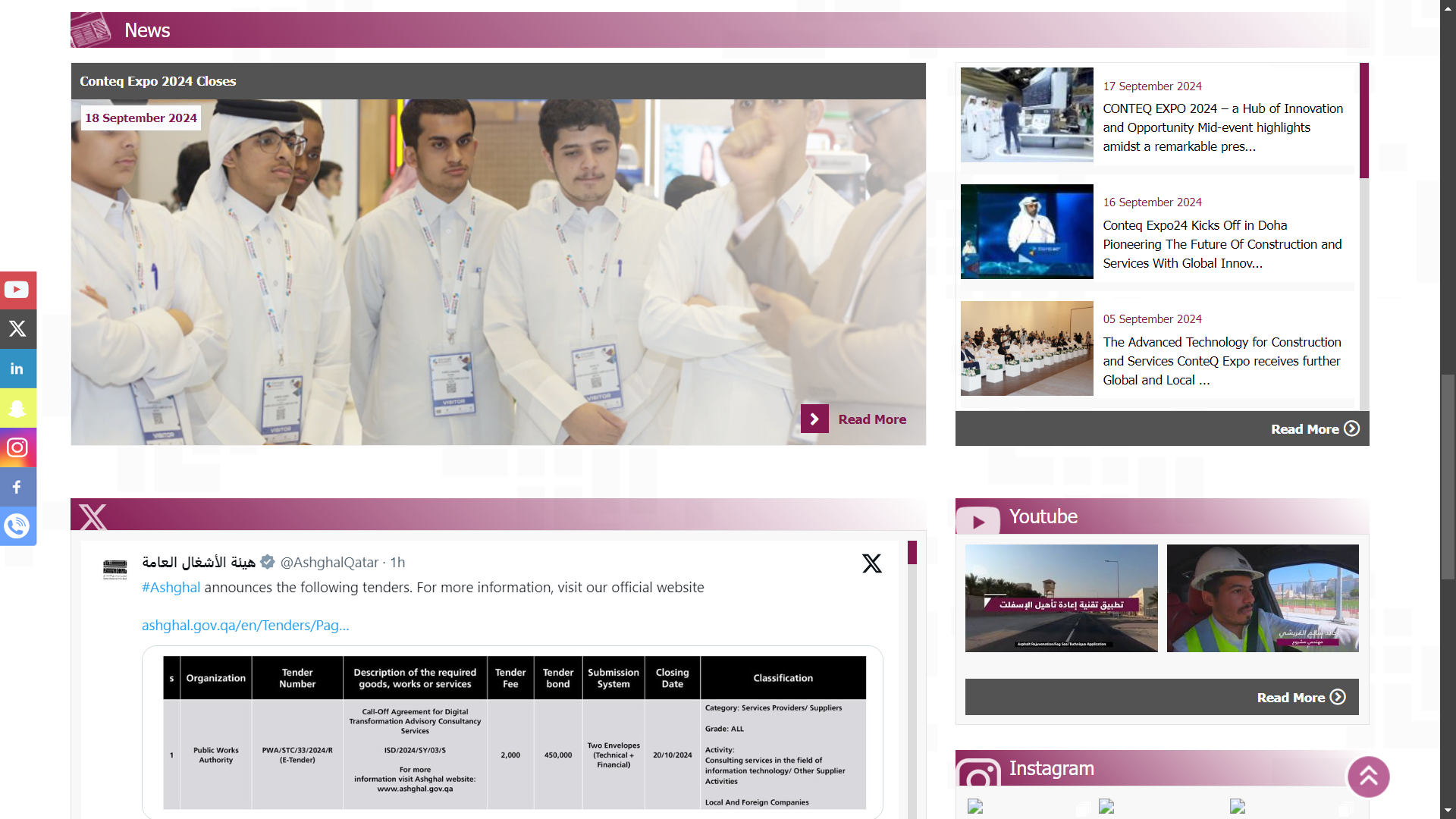
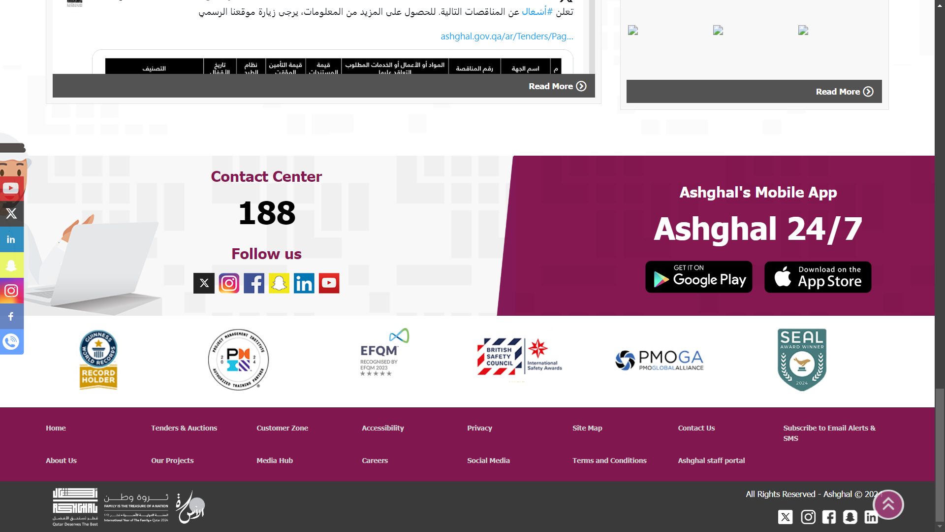
BEFORE
The original website featured a cluttered layout, with an overwhelming amount of text and a dated design that failed to engage users. Navigation was confusing, leading to a frustrating experience when searching for services.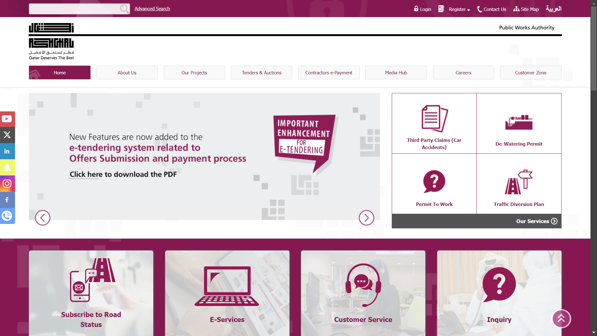
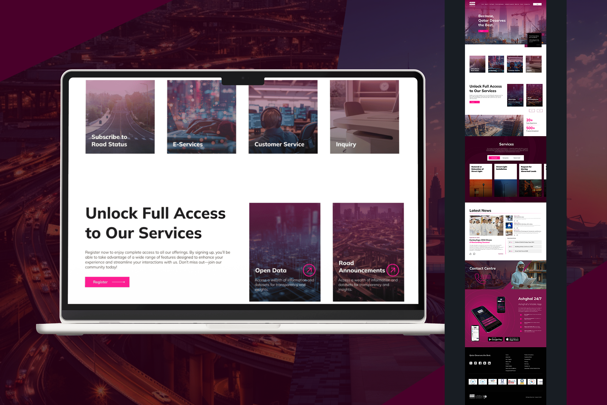
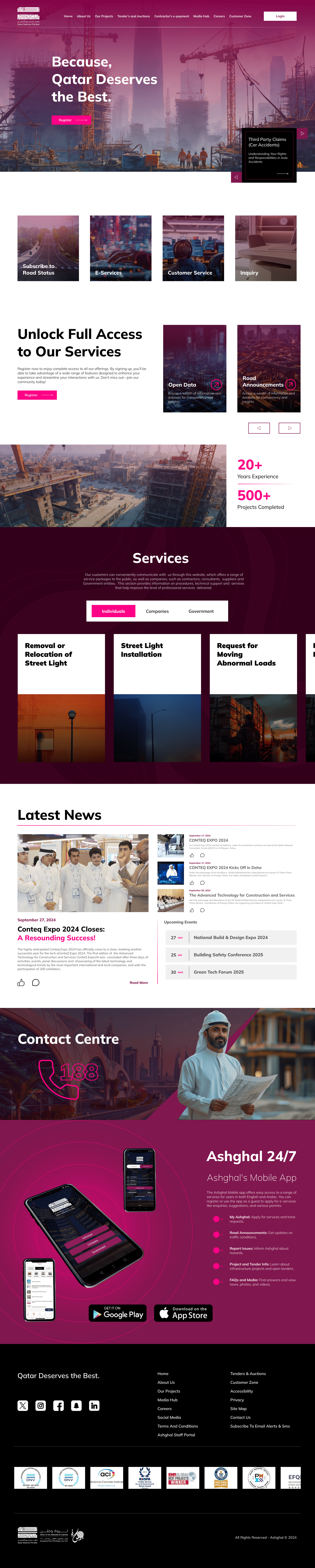
AFTER
The redesigned site emerged as a beacon of clarity. With a clean, organized layout, users could easily navigate and engage with the content. Key information was now accessible, inviting exploration and connection.


CONCLUSION
This project was more than just a website redesign; it was about reshaping the company’s digital narrative. The new website positions the construction firm as a modern leader in the industry, ready to meet the needs of clients and stakeholders. By focusing on user experience and visual appeal, we turned a cluttered past into a clear and engaging digital future.